Nightingale Health
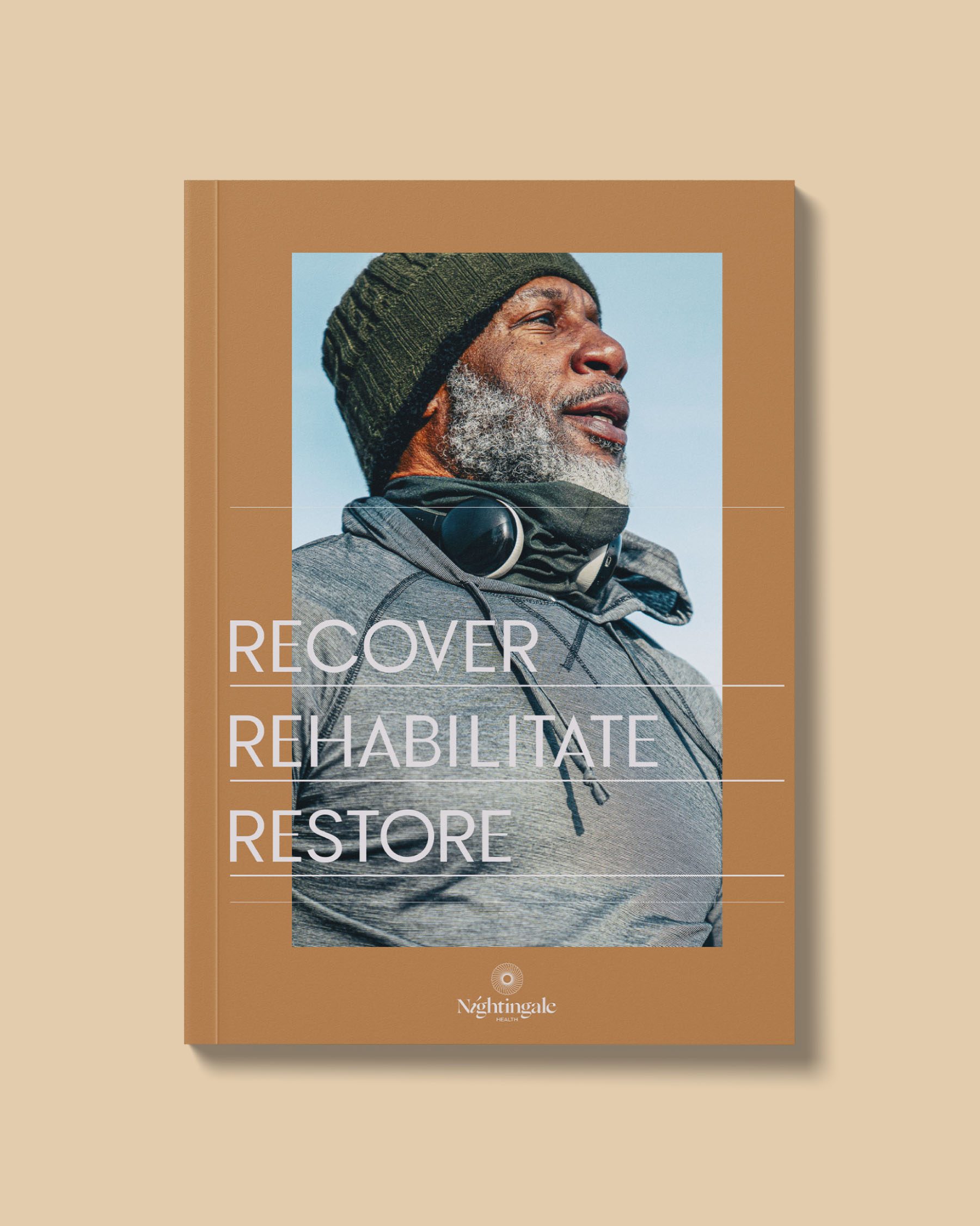
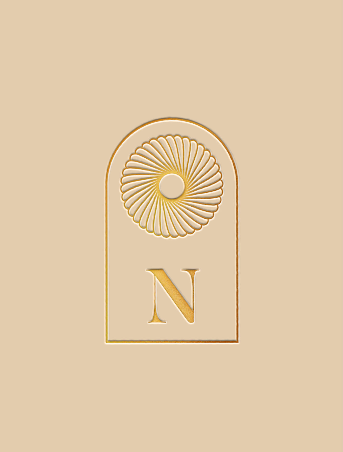
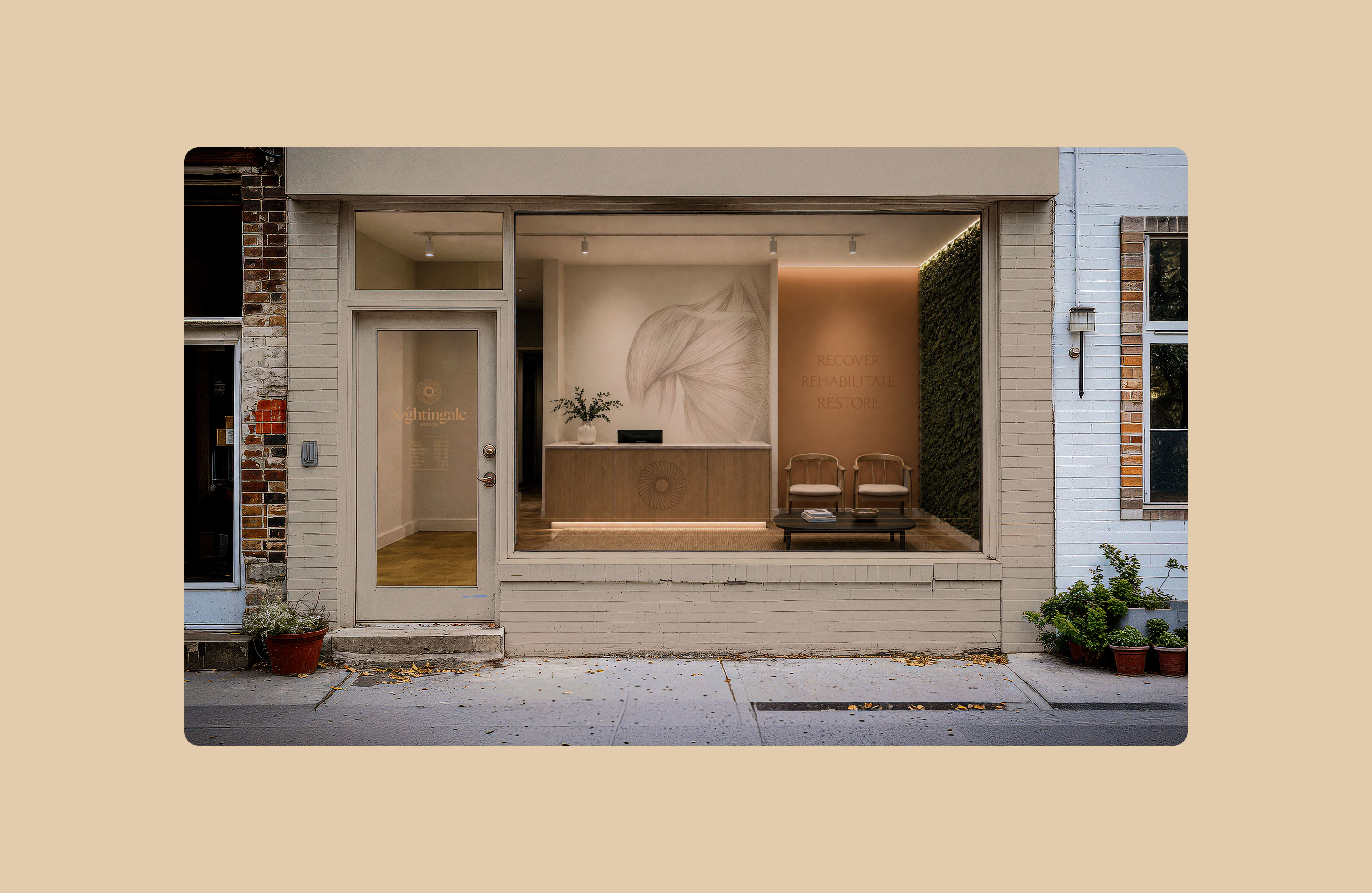
Nightingale Health is a boutique healthcare practice with an identity inspired by natural forms, combining a sense of structural strength with flexibility.
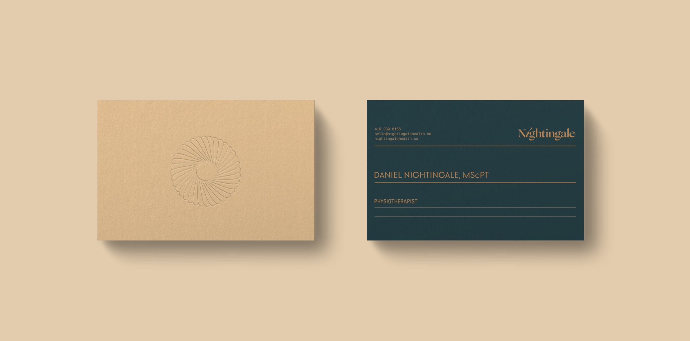
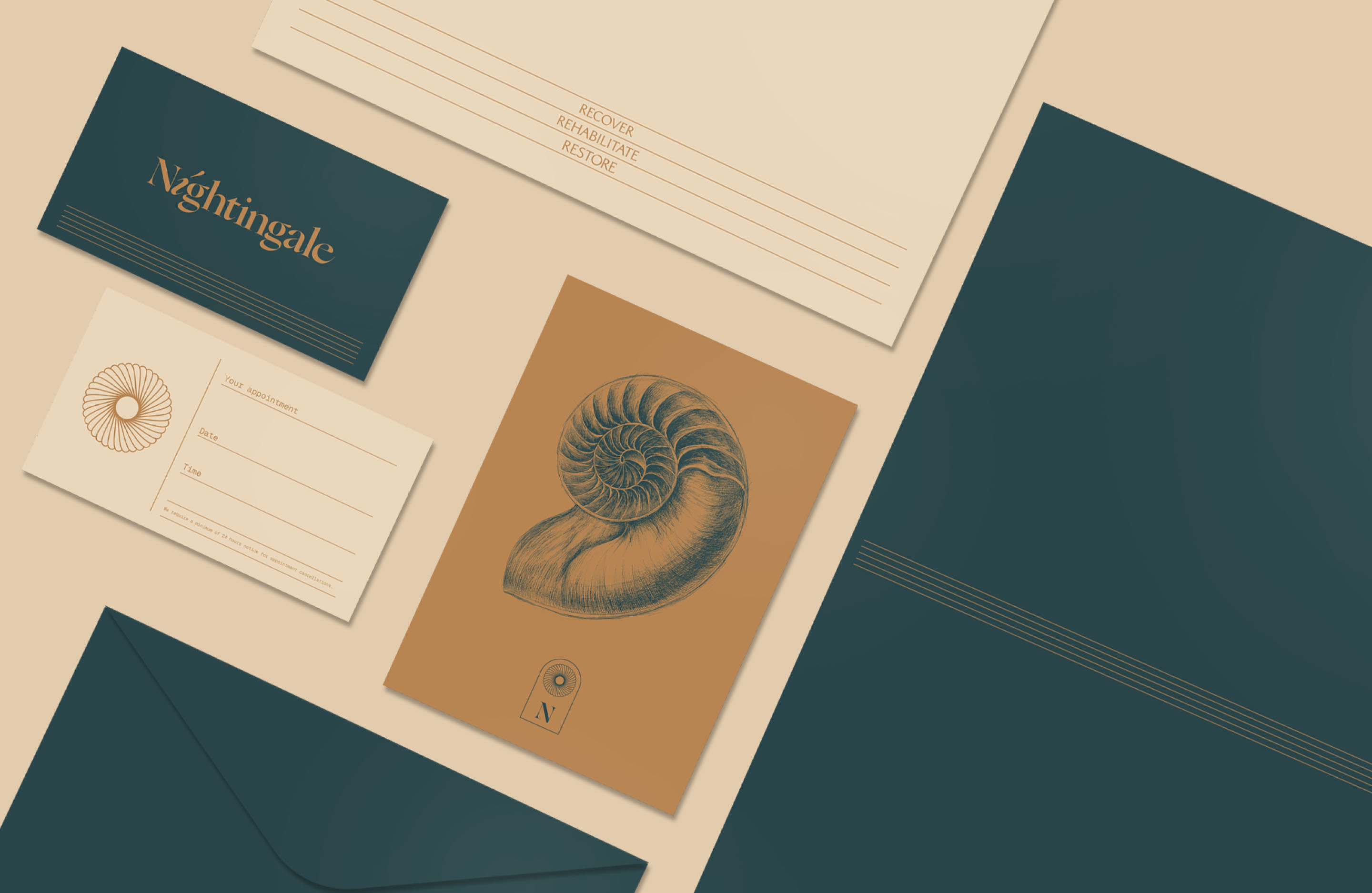
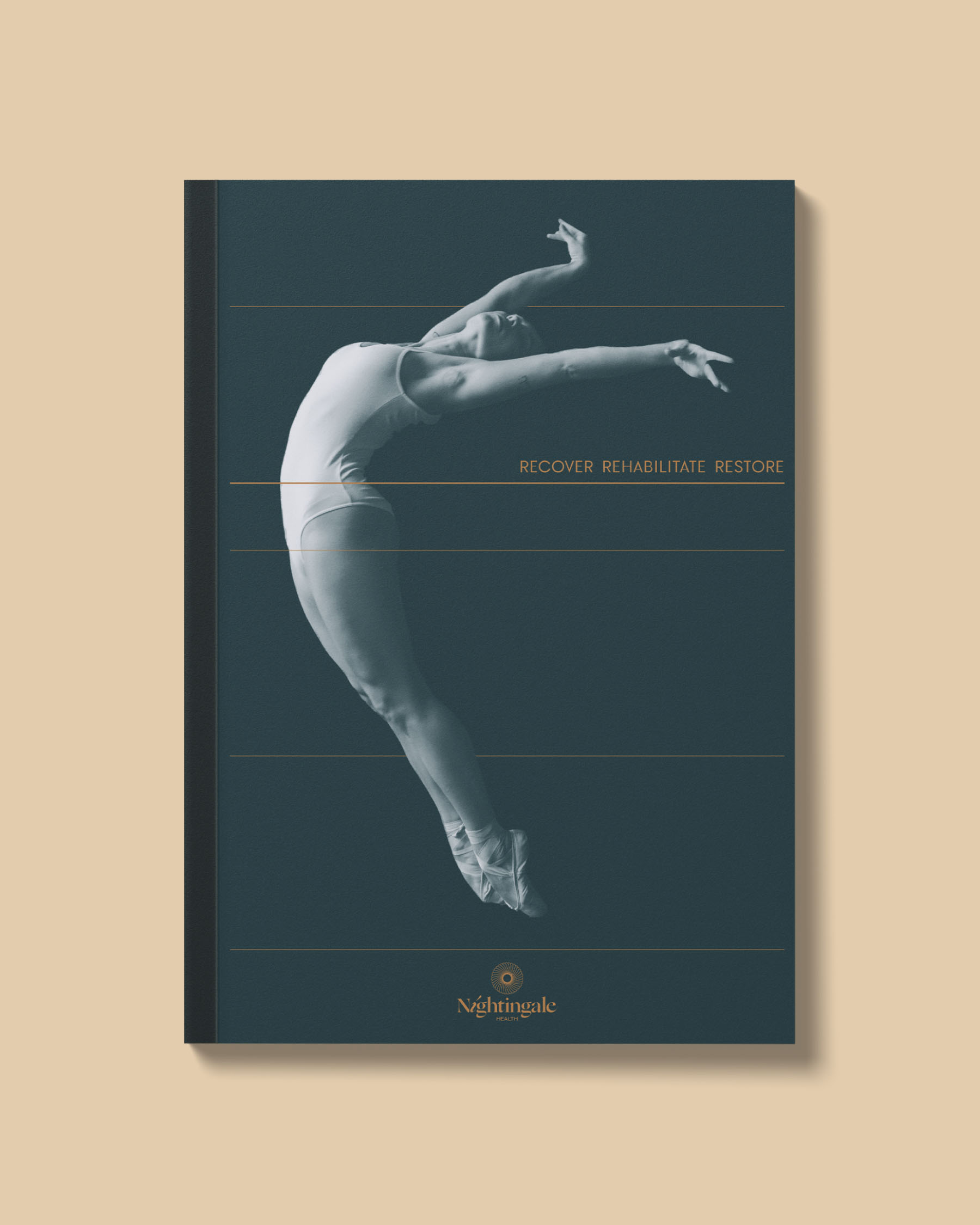
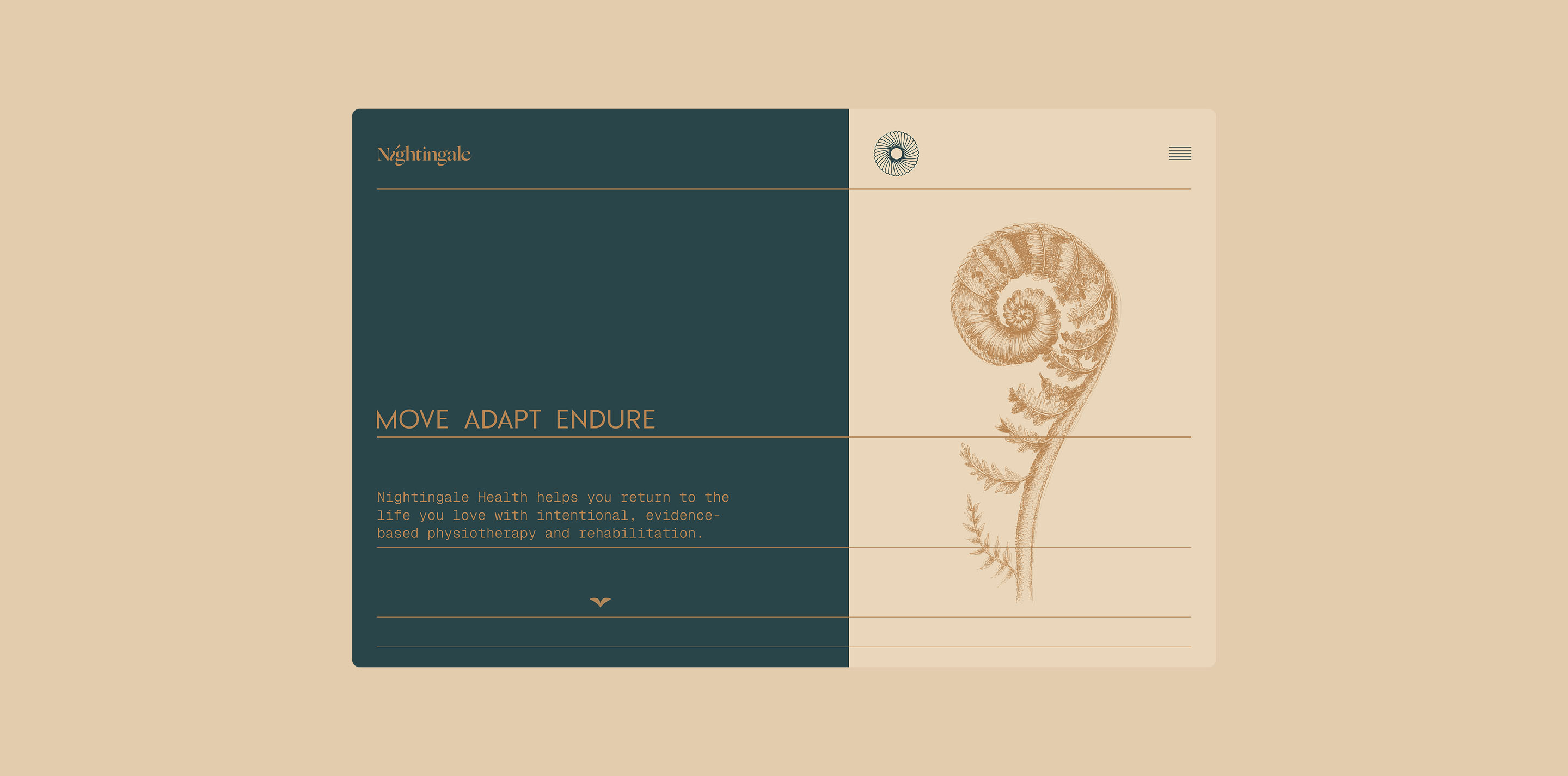
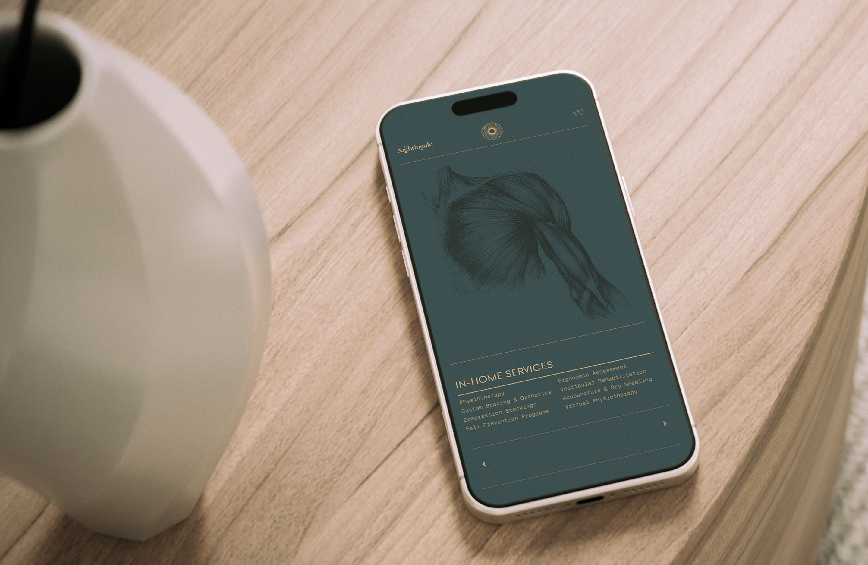
At the core of the brand is a system of five parallel lines. At rest they form a simple, ordered graphic element. In motion they expand and contract in response to the content around them. Across the brand, they follow the movement of the body or converge around joints and other points of physical stress. Rather than forcing content into a predetermined graphic system, the system responds to the content itself.
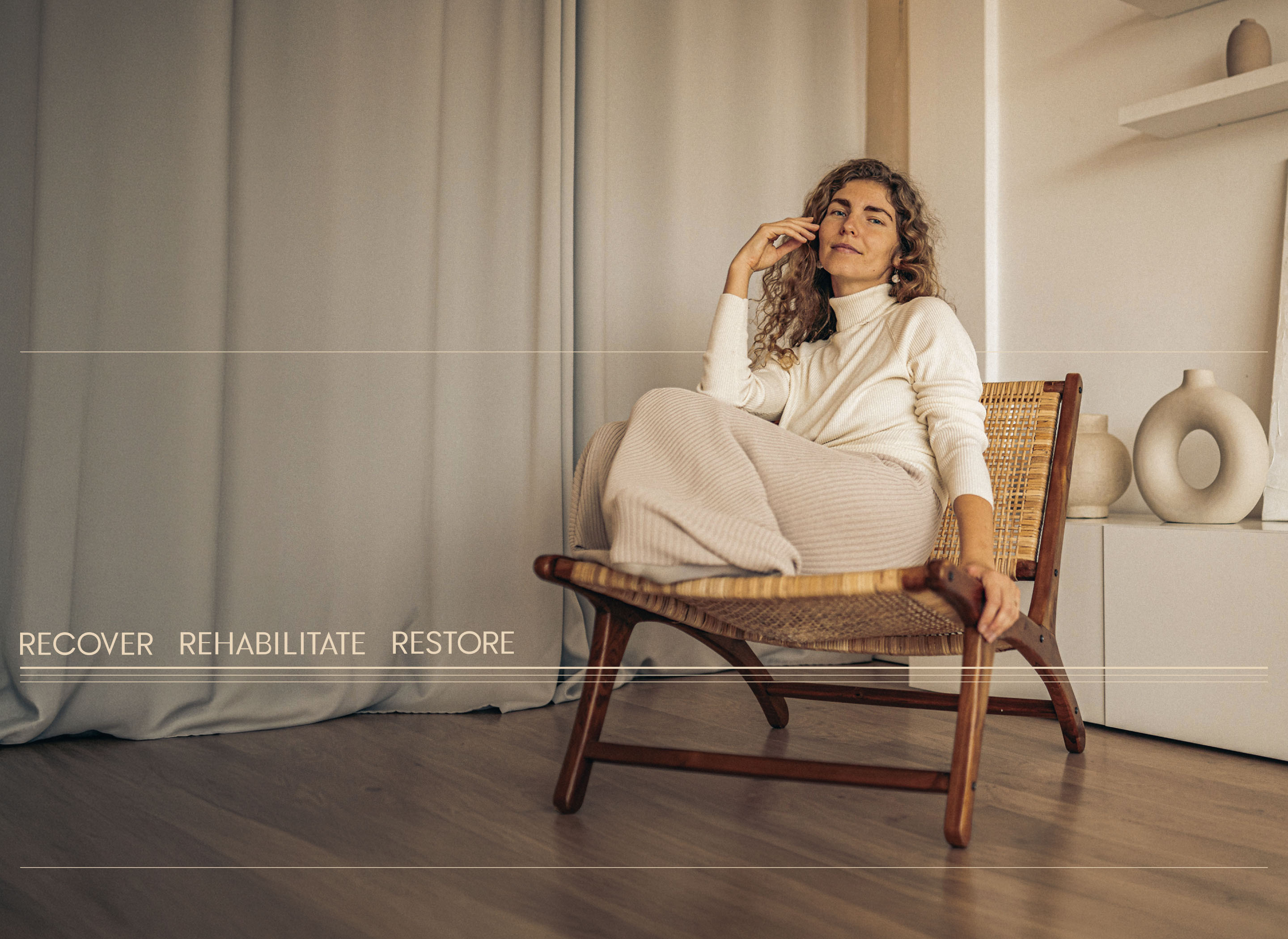
A palette of warm neutrals and a rich, earthy green gives the identity a calm and nurturing foundation.
This is complemented by a series of loose, observational line drawings depicting both human anatomy and objects from the natural world. Subjects such as the nautilus shell and fern were chosen specifically as examples of natural structures that combine delicacy, resilience and strength.
Together, these elements create a brand that approaches rehabilitation not only through the language of healthcare, but through a broader study of movement and order in the natural world.
Branding
Art Direction
Collateral
Creative Strategy
Digital Design
Graphic Design
Identity Systems
Logotype
Naming
Packaging Design
Print Material
Visual Identity Design
Windsor, Ontario
Canada
© 2008 — Now