Jarman Professional
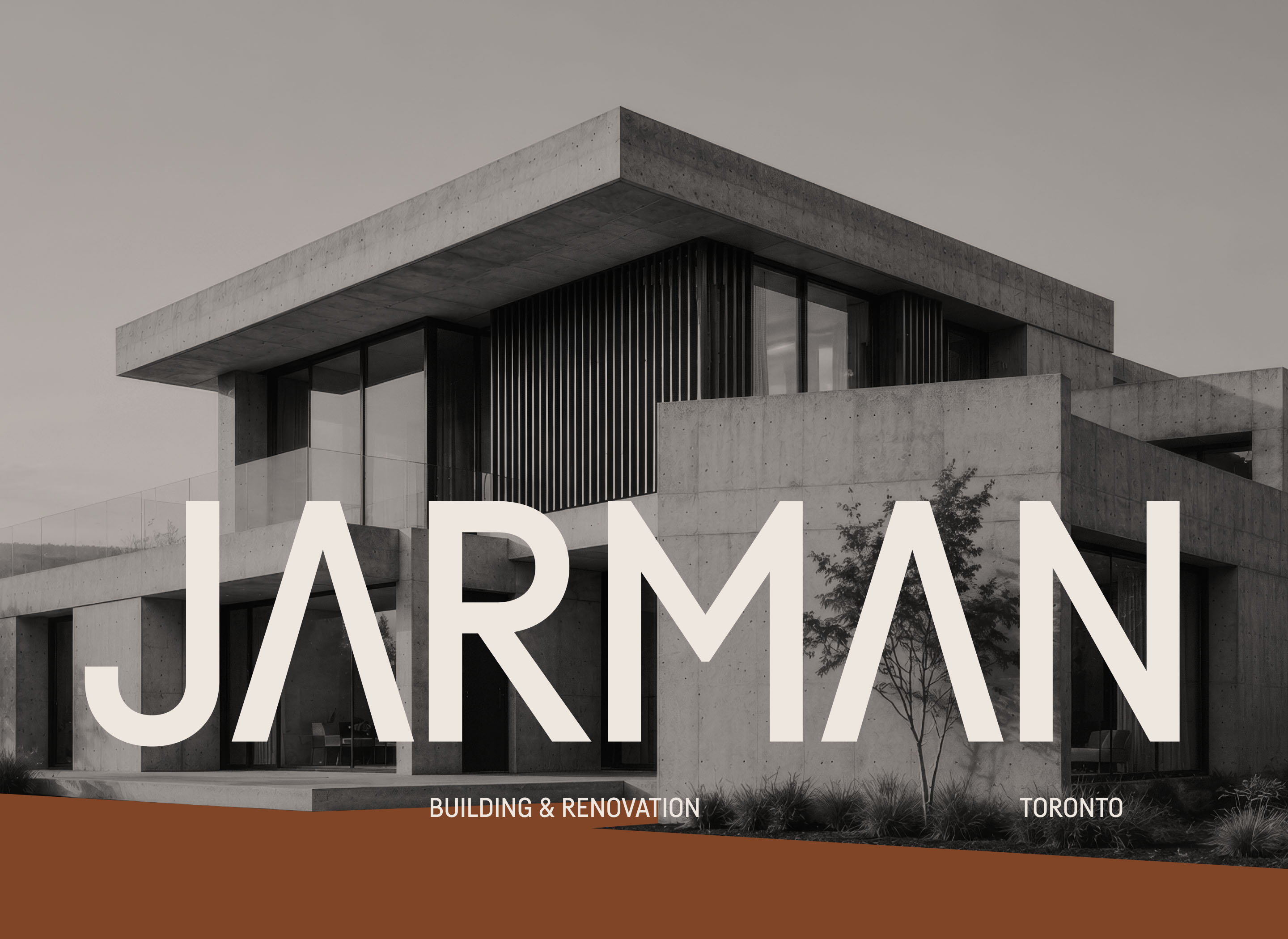
Jarman is a boutique construction and renovation firm in Ontario. The branding needed to communicate the physicality and precision of the work without relying on the familiar visual tropes of the construction industry.
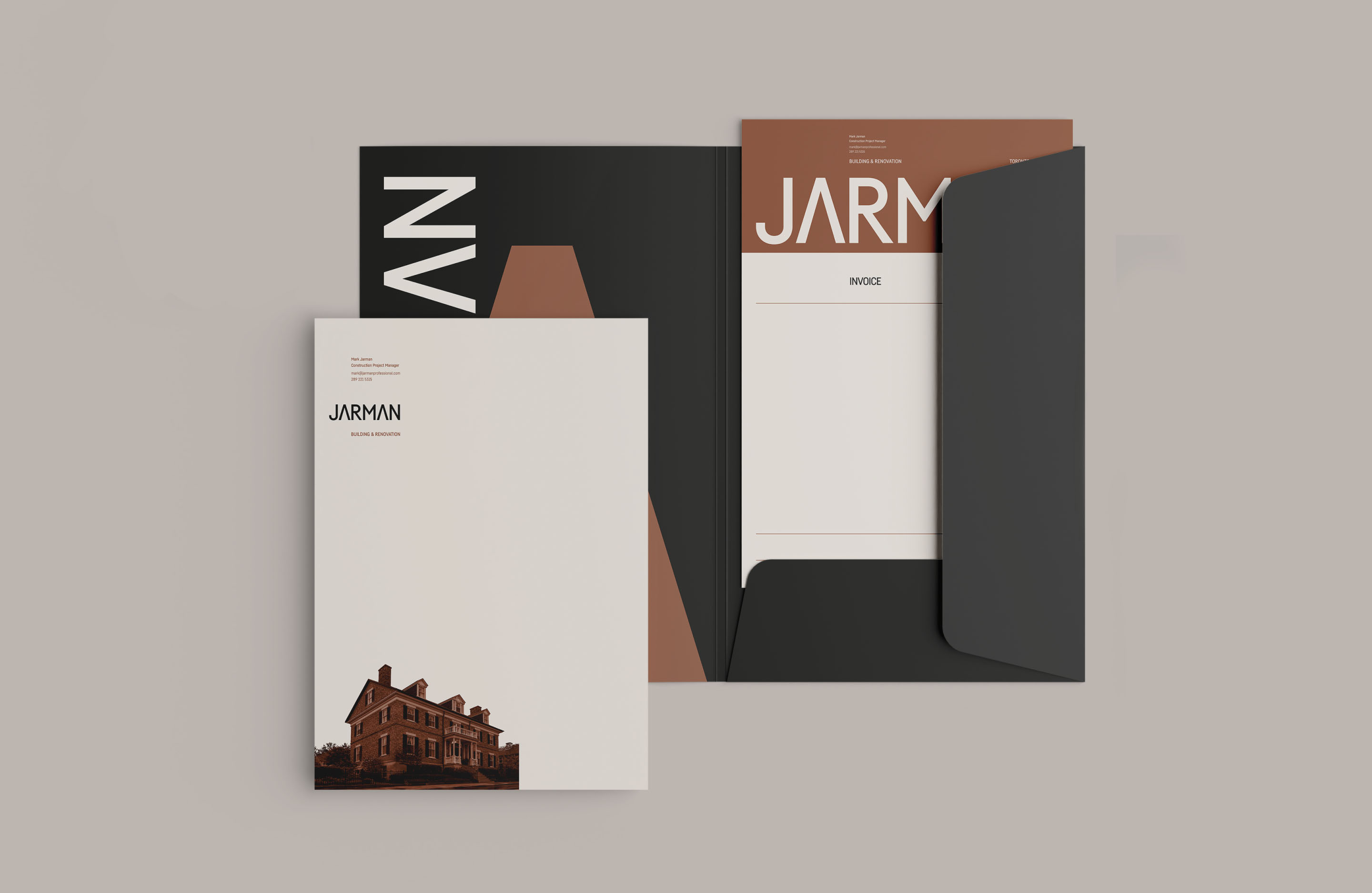
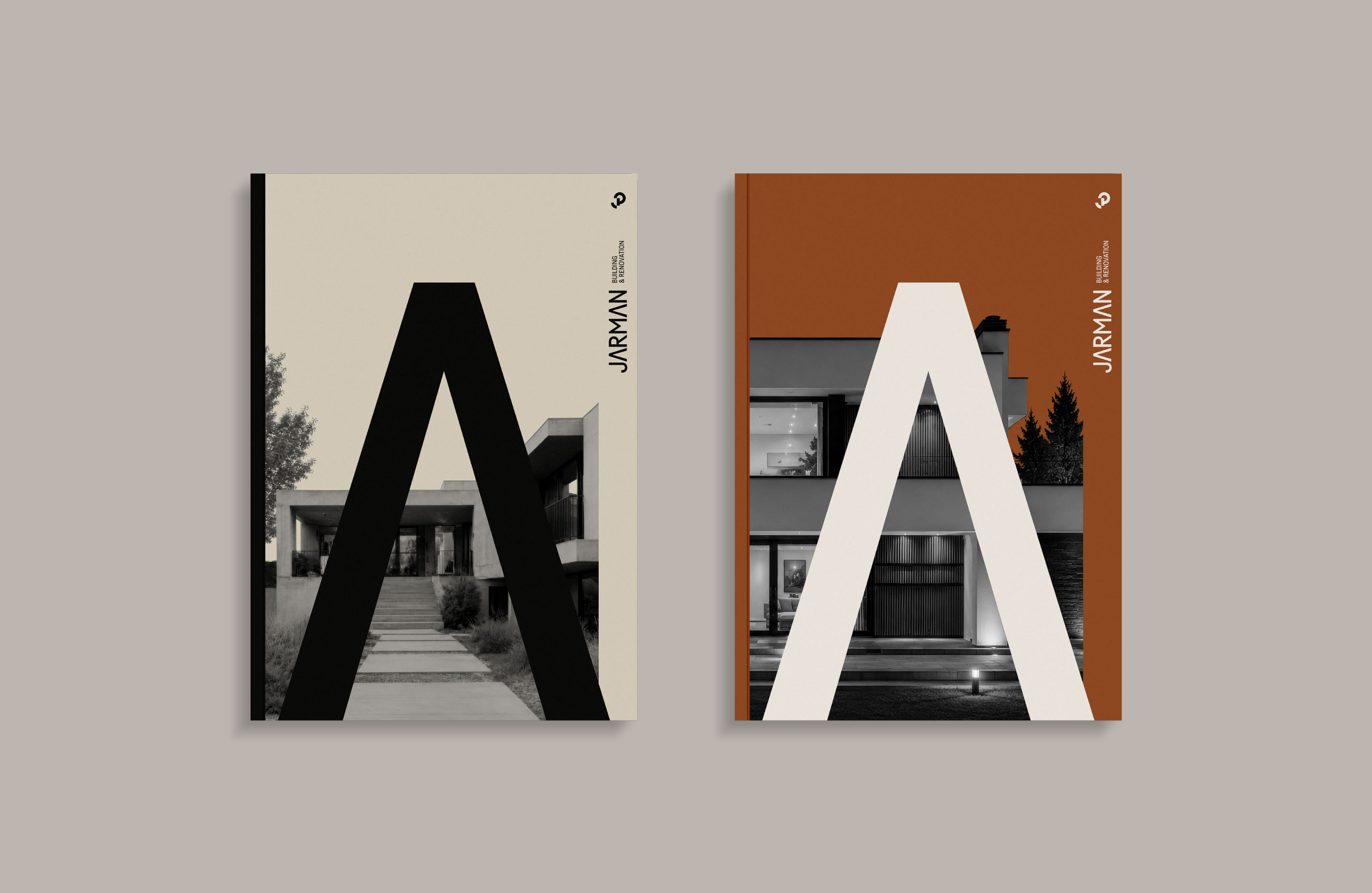
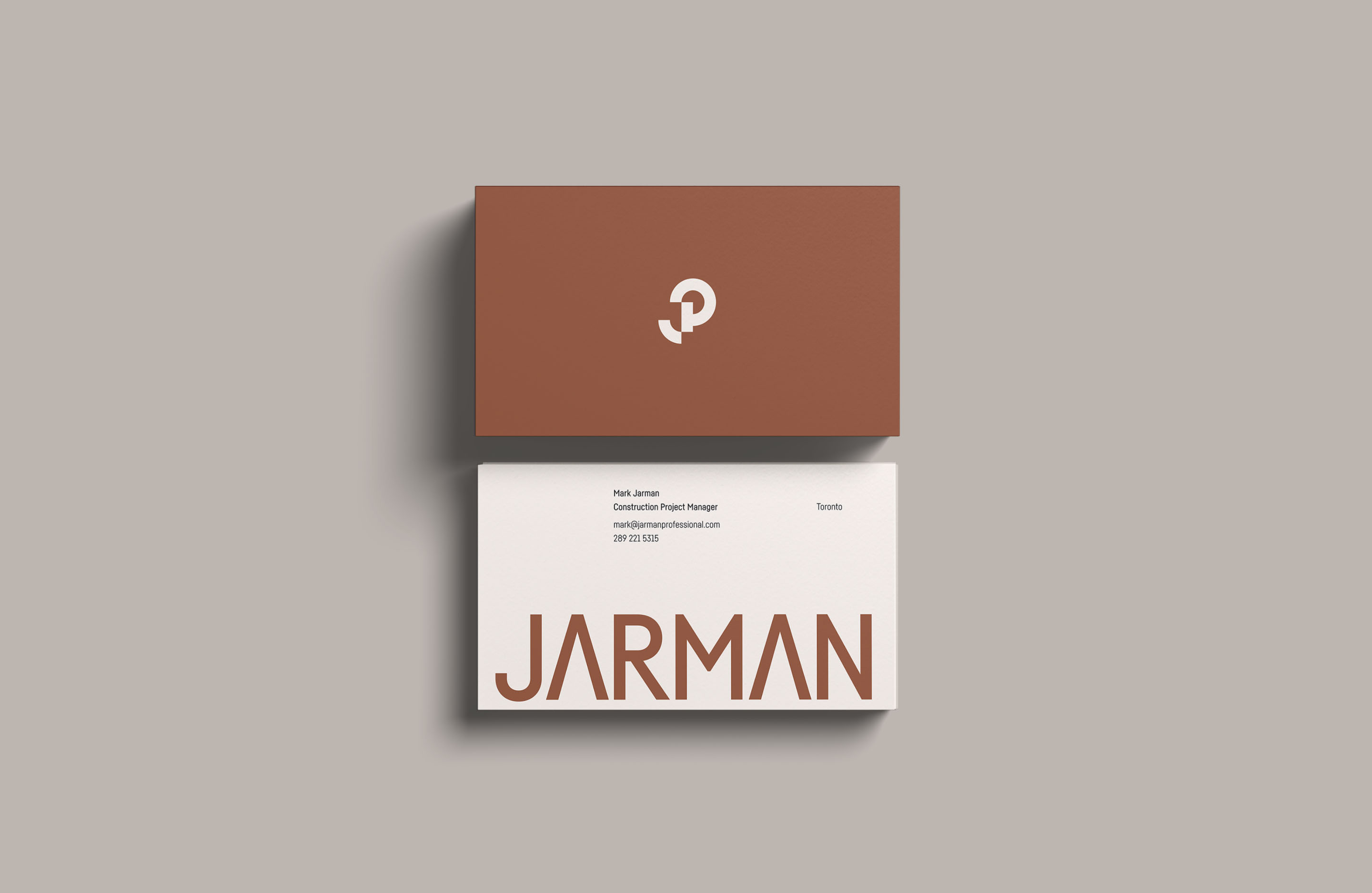
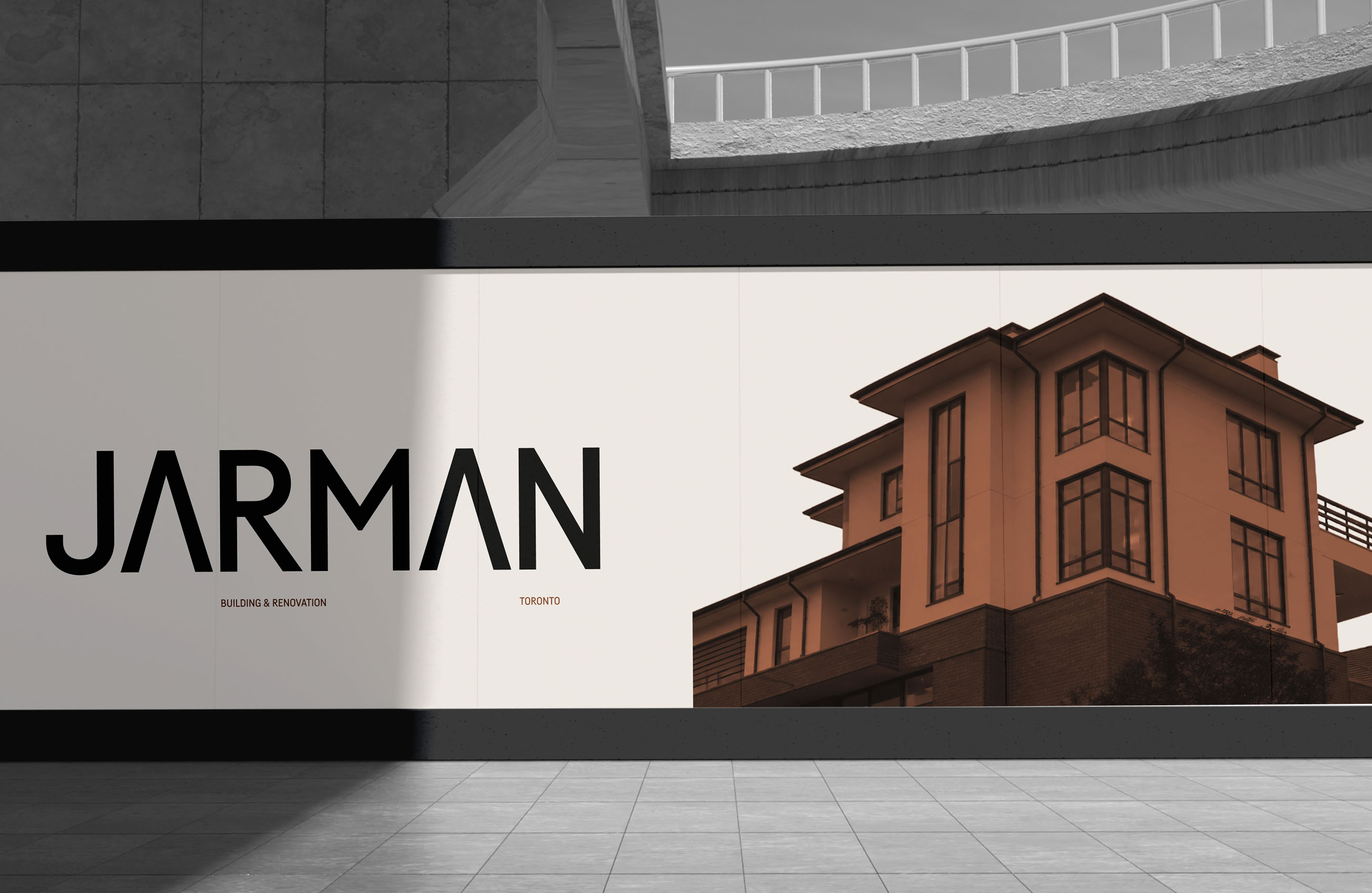
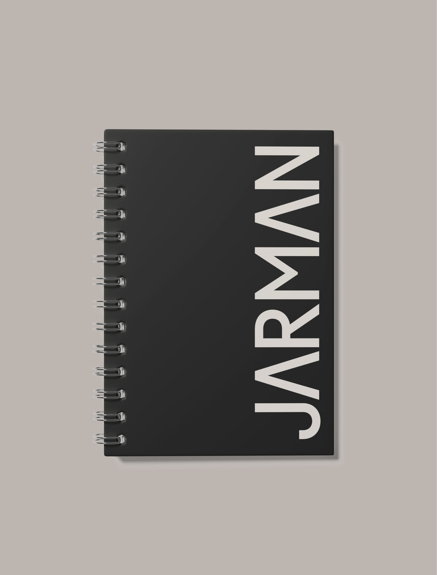
A sturdy, no-nonsense wordmark anchors the identity, paired with a structural monogram that translates the geometry of architectural drafting into a distinctive brand element. The same approach carries through to the photography: sparse and direct, with hard crops and sharply defined edges rather than fades, overlays or unnecessary effects.
The colour palette deliberately avoids the bright primary colours common throughout the category. Warm brown, black and restrained neutrals give the identity a quiet sophistication without ever feeling exclusive. The result is a brand that feels entirely appropriate for a construction company while claiming it's own unique visual territory.


Branding
Art Direction
Collateral
Creative Strategy
Digital Design
Graphic Design
Identity Systems
Logotype
Naming
Packaging Design
Print Material
Visual Identity Design
Windsor, Ontario
Canada
© 2008 — Now