YellowYellow
YellowYellow is a boutique ESG advisory working with organizations to better understand, communicate and improve their environmental and social impact. In a sector with a well-established visual language, the YellowYellow brand needed to communicate sustainability without merely reproducing its familiar conventions.
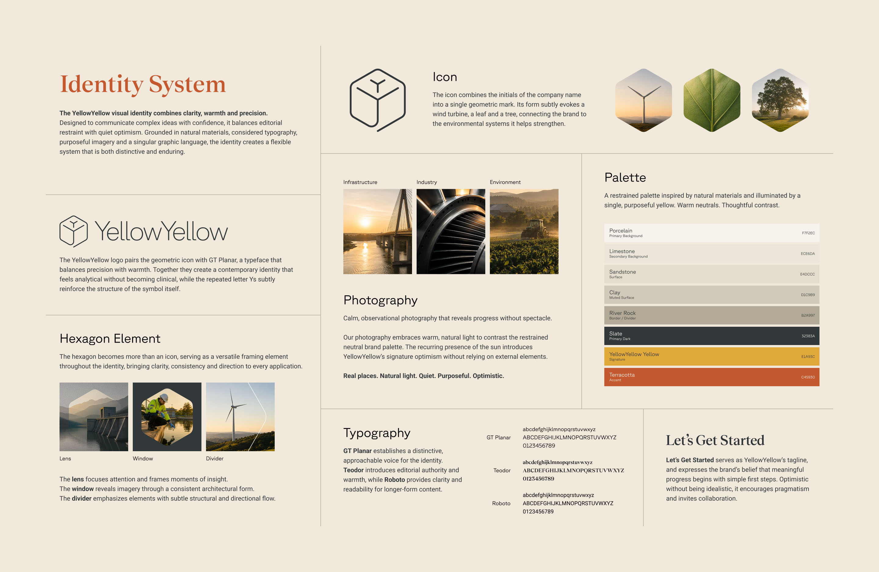
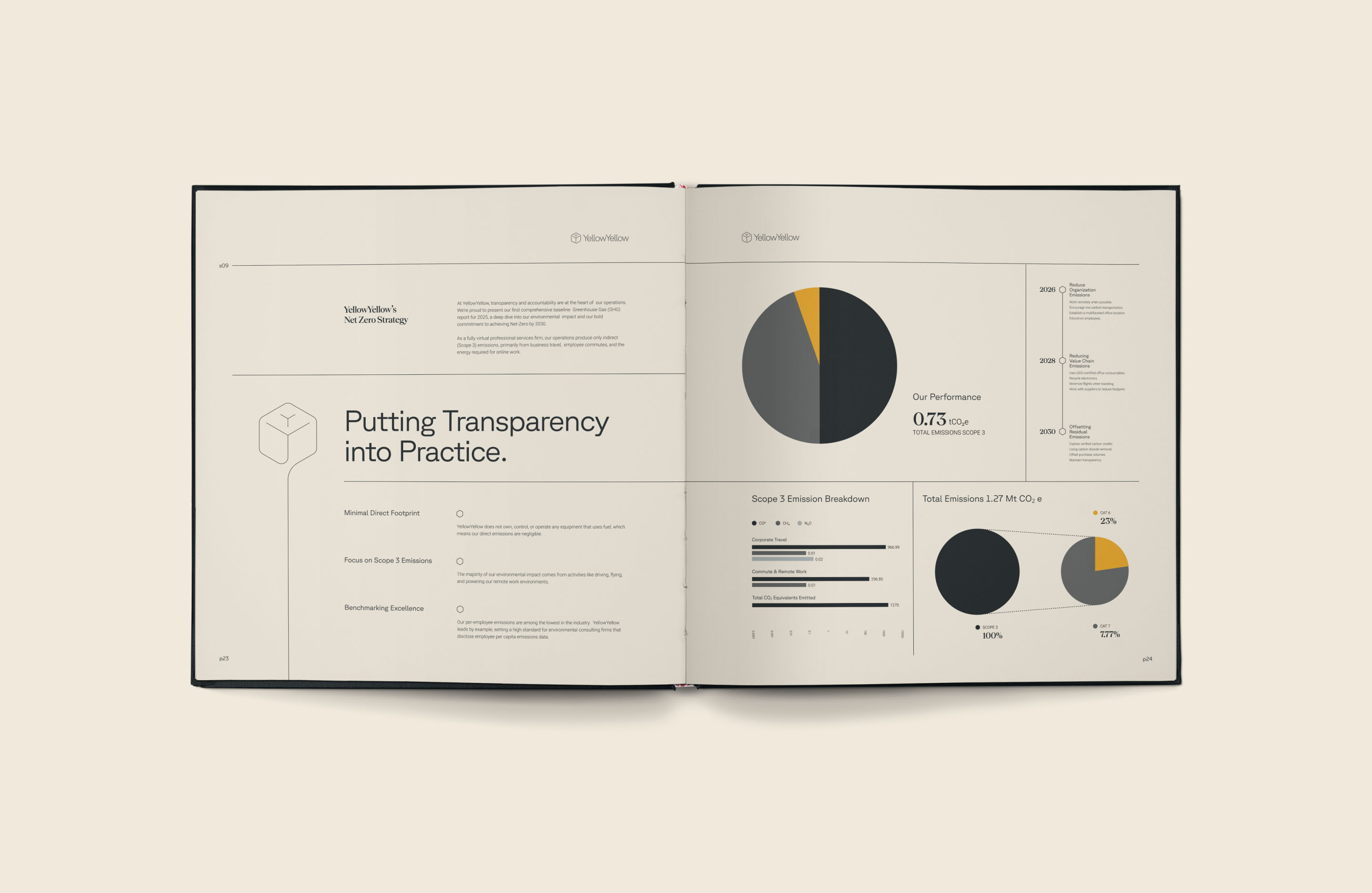
At its centre is a deceptively simple mark that combines YellowYellow’s initials into a form simultaneously symbolizing a wind turbine, a leaf and a tree. Its hexagonal geometry becomes a recurring device throughout the brand, framing photography, organizing information and creating continuity across print and digital applications.
Originality doesn’t always mean rejecting the obvious. YellowYellow was named for yellow’s dual associations with optimism and caution, making the colour an unusually meaningful part of the brand from the outset. The mustard-yellow palette embraces that idea while deliberately stepping away from the greens expected of the category, giving YellowYellow an immediate visual presence without sacrificing the clarity and authority expected of an advisory practice.
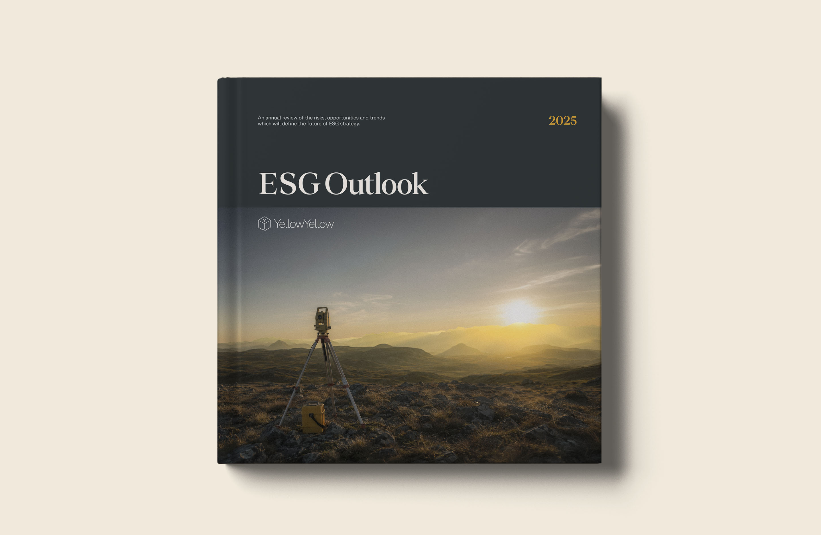
The result is a brand that feels entirely at home within the ESG sector, but with a level of clarity, confidence and refinement that sets YellowYellow apart from its peers.
I’m so grateful for Simon's rebranding of our ESG advisory firm. He transformed our outdated brand into a modern, compelling visual identity that truly reflects our mission and values. The new branding has positioned us as leaders in our field, and the positive feedback from clients has been incredible. Simon was creative, deeply understood our needs and his work has significantly boosted our engagement and interest in our services.
Lisa Annabel Ellis, Founder & CEO, YellowYellow







Branding
Art Direction
Collateral
Creative Strategy
Digital Design
Graphic Design
Identity Systems
Logotype
Naming
Packaging Design
Print Material
Visual Identity Design
Windsor, Ontario
Canada
© 2008 — Now