
Client
Purefacts
Agency
K2XO
Project Manager
Adam Ongkawidagdo
Director of UX
Steven LeMay
Creative Director
Simon P. Coyle
Art Director
Edward Phung
Technology Director
Darko Antic
PureFacts is a tech-driven financial services software company based in Toronto. Their primary product is PureWealth, a suite of applications aimed at financial advisors. They also offer custom design and development under the PureSolutions banner.
PureFacts own one of the digital agencies I used to work at, and asked our team to rebrand them. As ever, it started with identifying the stakeholders, talking to clients, taking a step back from the existing company structure, and lots of peer and competitor reviews.
One of the advantages to collaborating in such close proximity to a client is the ability to work through ideas quickly. So here you'll see the three core concepts in the order they were developed, and how elements of each informed the next.
VERSION 1 — BAR CHART

Version 1 of the PureFacts identity is based on one of the most ubiquitous symbols of financial reporting - the bar chart.
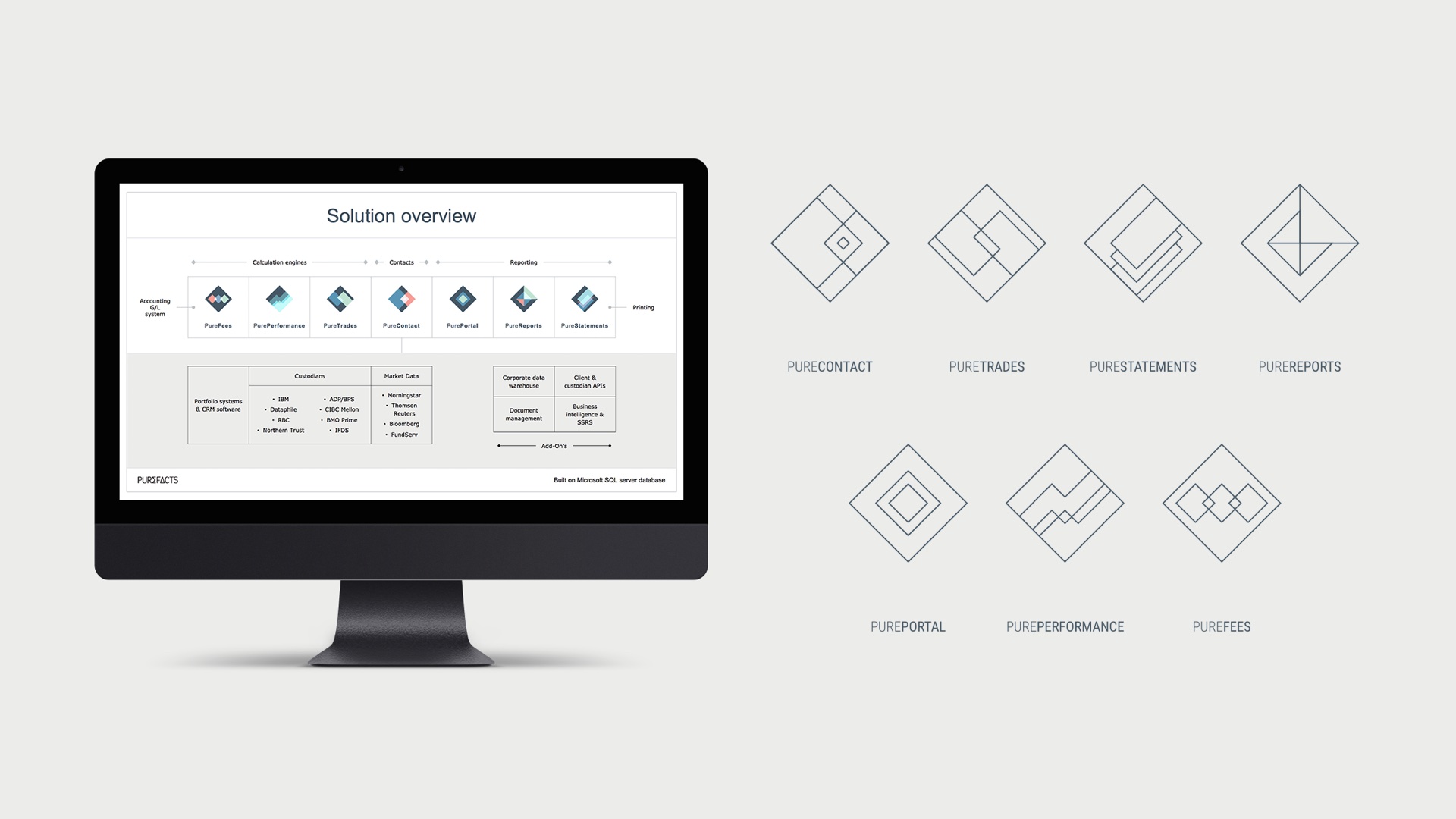
The PureWealth platform is comprised of 12 distinct applications, and I had this notion of taking the bar chart, and from it creating a truly dynamic contextual identity system for PureFacts, its sub-brands and it's entire product ecosystem.
I had a feeling that this would be a little too confrontational and audacious for a company in such a traditionally conservative market (a feeling which turned out to be completely correct), but still, it's important to explore.

VERSION 2 — THE ANSWER IS...
And just one reason why exploration is so important, is because it can - and most likely will - lead to better ideas.
The basis for "The Answer is..." is a set of mathematical symbols that were originally created from the bar elements of version 1.
I'm a great believer in simplicity in branding - ideally a person should not have to decipher more than one idea when looking at an identity. The mathematical symbols alongside the bar chart were conceptually too much.
However, as I continued to work with them, and introduced colour, they seemed strong enough to carry the identity on its own. Cooper Black softens the edges of the whole thing - a little quirky without going too far. And the symbols opened up some playful marketing ideas (although I will admit that "multiply wealth" is reaching).

VERSION 3 — SUM/CHANGE
"Sum/Change" is where it all came together. While the client considered version 2 a little too simplistic, it at least had the effect of sparking some excitement around the idea of embedding mathematics into the logo.
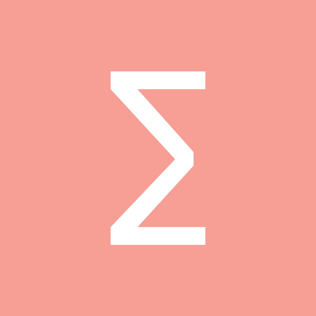
This is sigma, the latin symbol for sum.
In this context, it represents the comprehensiveness of PureFacts' offerings, and the "more than the sum of their parts" skillsets throughout the company,
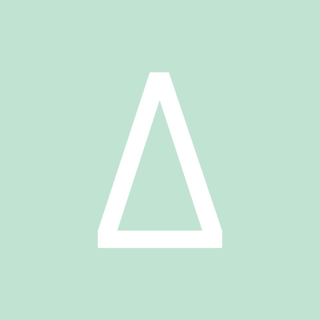
And this is delta, which means change.
The change of disruption and transformation.
And this is delta, which means change.
The change of disruption and transformation.
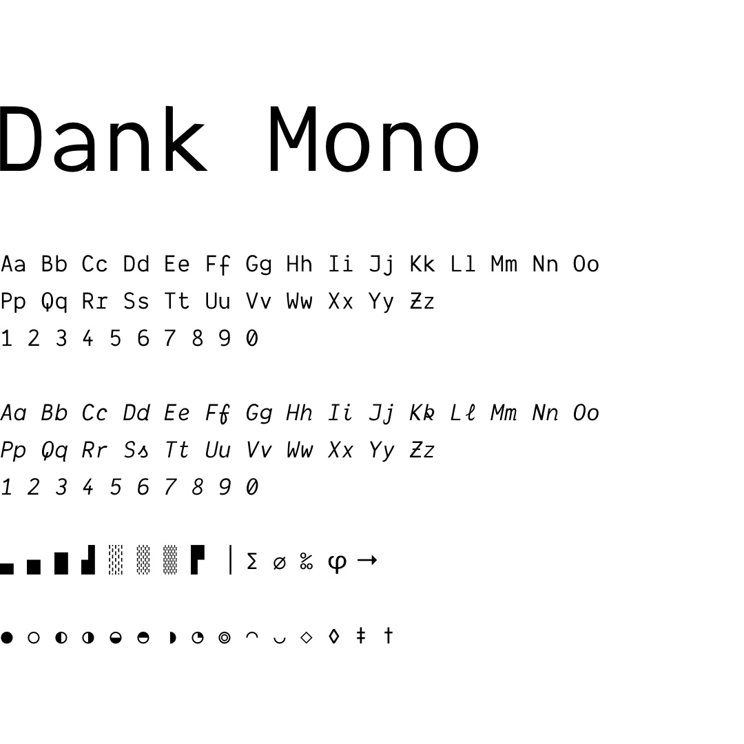
The PureFacts logotype is set in Dank Mono, a typeface designed by Phil Plückthun.
What makes Dank Mono interesting, is that Phil is not a typographer or even a designer - he's a developer, and created this monospaced typeface optimized for coding on high resolution displays.
For PureFacts, a technology company, featuring Dank Mono so prominently makes an important statement about their priorities.
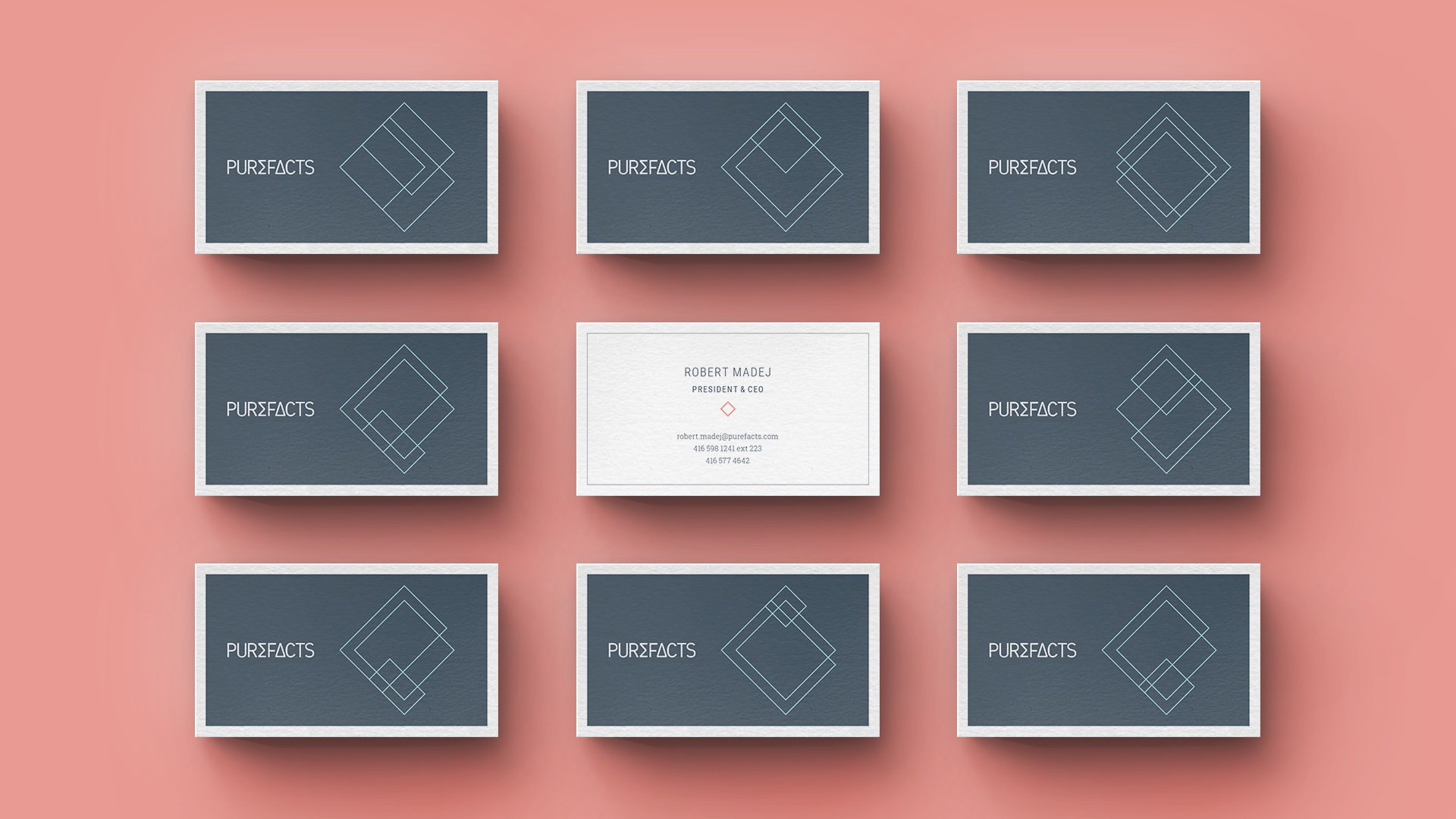
Secondary branding elements consist of wireframe geometric patterns of three overlapping rectangles, representing PureFacts, PureWealth and PureSolutions, and the differing skillsets which combine in different amounts when necessary.
The PureWealth sub-brands were also given their own marks, in a similar style.
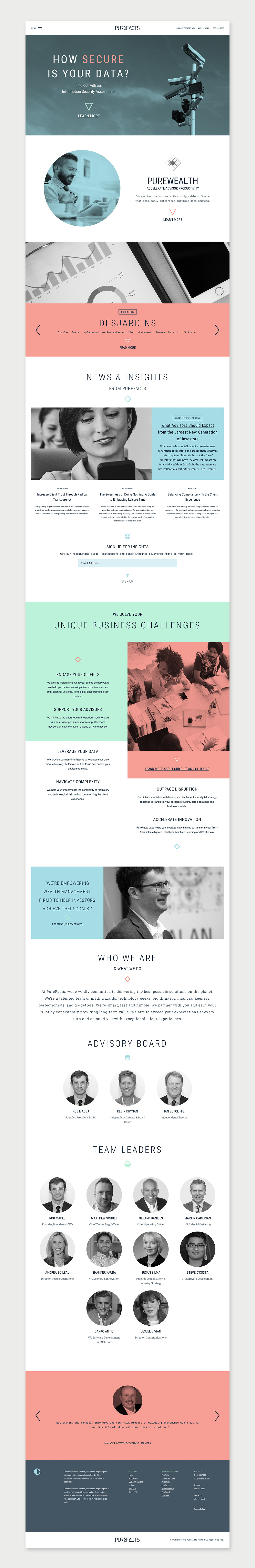
When it came to the web site, it was important that PureFacts stand apart from the crowd.
Bold use of colour, lots of uppercase, loose letter spacing, bigger-than-normal leading and old-school underlined links convey the profound confidence that PureFacts has in who they are and where they're going.
Case Studies


COPYRIGHT 1996—2025