Client
Kinross
Agency
K2XO Inc.
Director of Strategy
Pat Sathiensamrit
Creative Director
Simon Coyle
Director of User Experience
Steven LeMay
Art Director
Edward Phung
For a Canadian company with such a rich history, it was no surprise that in 2018, Kinross Gold wanted to celebrate their 25th anniversary in style.
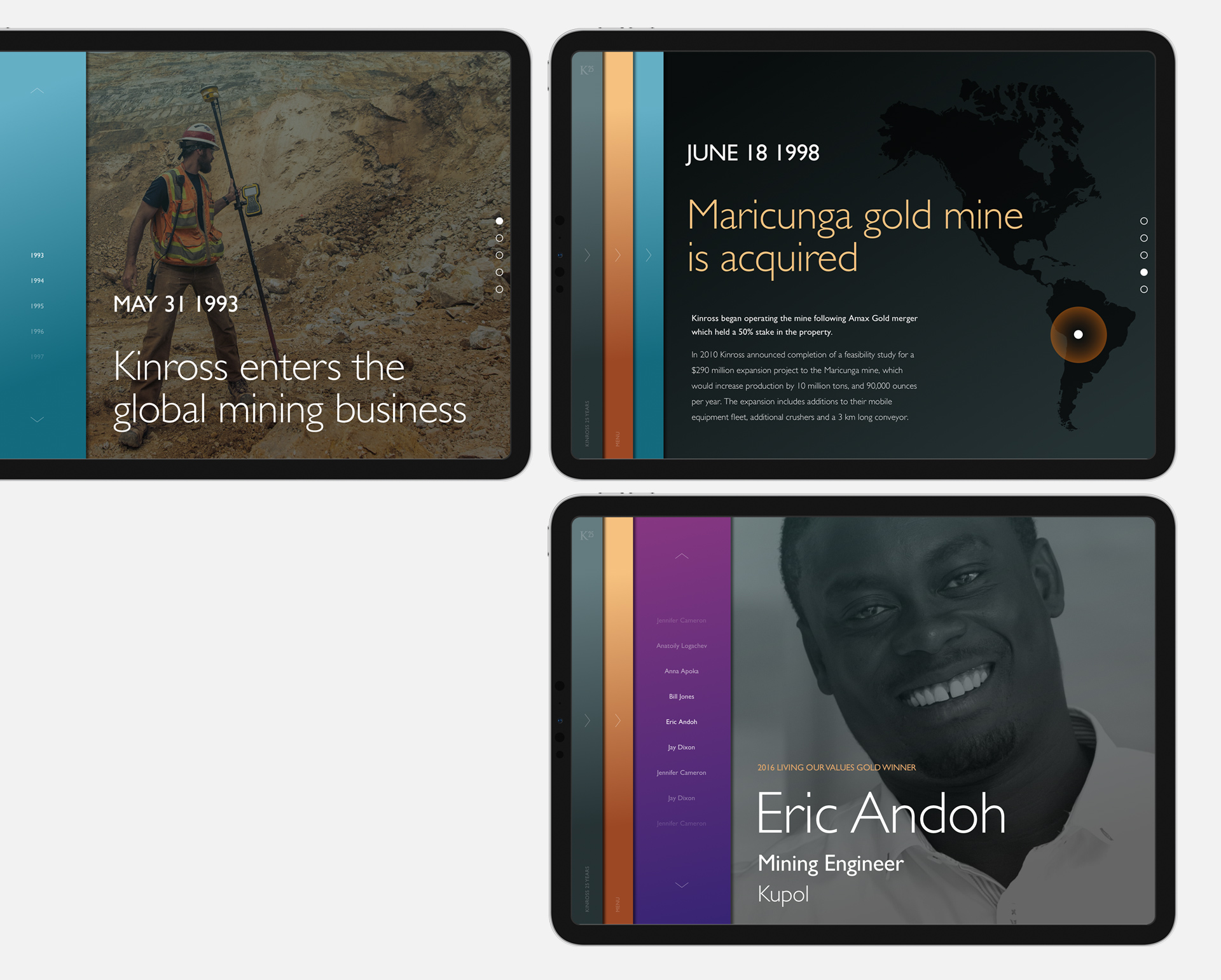
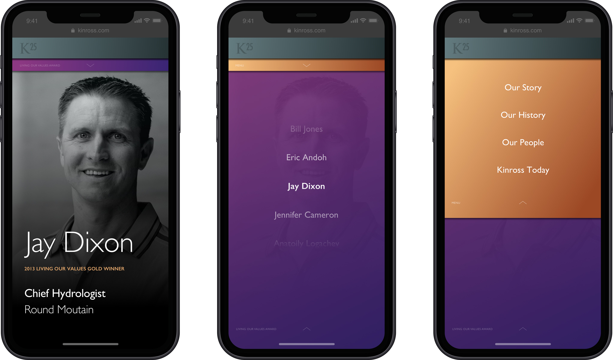
On the cards was a revamped logo to be used on all communications and campaigns throughout the anniversary year, and a new online presence, envisioned by the client as a public-facing microsite, to include an overview of Kinross' first twenty-five years, a short interactive timeline of its most defining moments, a glimpse at what's planned for the future, and a section dedicated to the past and present winners of the Living Our Values Award, an annual celebration of outstanding individual achievement at Kinross, voted on by employees from around the world.
The logo was the first thing to be tackled, and we went through a number of interations. Given Kinross' truly international reach, Roman numerals were quickly taken off the table, which left us with the most obvious (and best) solution.
To cover all of Kinross' head offices and mining sites across the globe, the logo was translated into Spanish, Portuguese, French, Arabic and Russian.
And while the standard Kinross logo, above, is always presented in black and gold, we modernized the 25th anniversary version just a little bit, by getting rid of the background and reproducing it in a single colour.
The microsite was less straightforward.
When you do anything over and over again for long enough, you get to know yourself very well. And one thing I know about myself is that I do my best work when I'm enjoying doing it. Not having fun, necessarily, but enjoying the larger process of problem-solving and creation. I think we've all had that experience of looking at a piece of creative work and feeling the emanating sense of infectious enthusiasm that went into its making. And on the other end of that, we can all feel the dullness from a piece of work which clearly originates in grinding obligation.
So while the team could have made a great microsite, one that would have made the client happy, there was a desire to go a bit further, to take the raw materials and put them together in ways that went beyond what the client had considered.

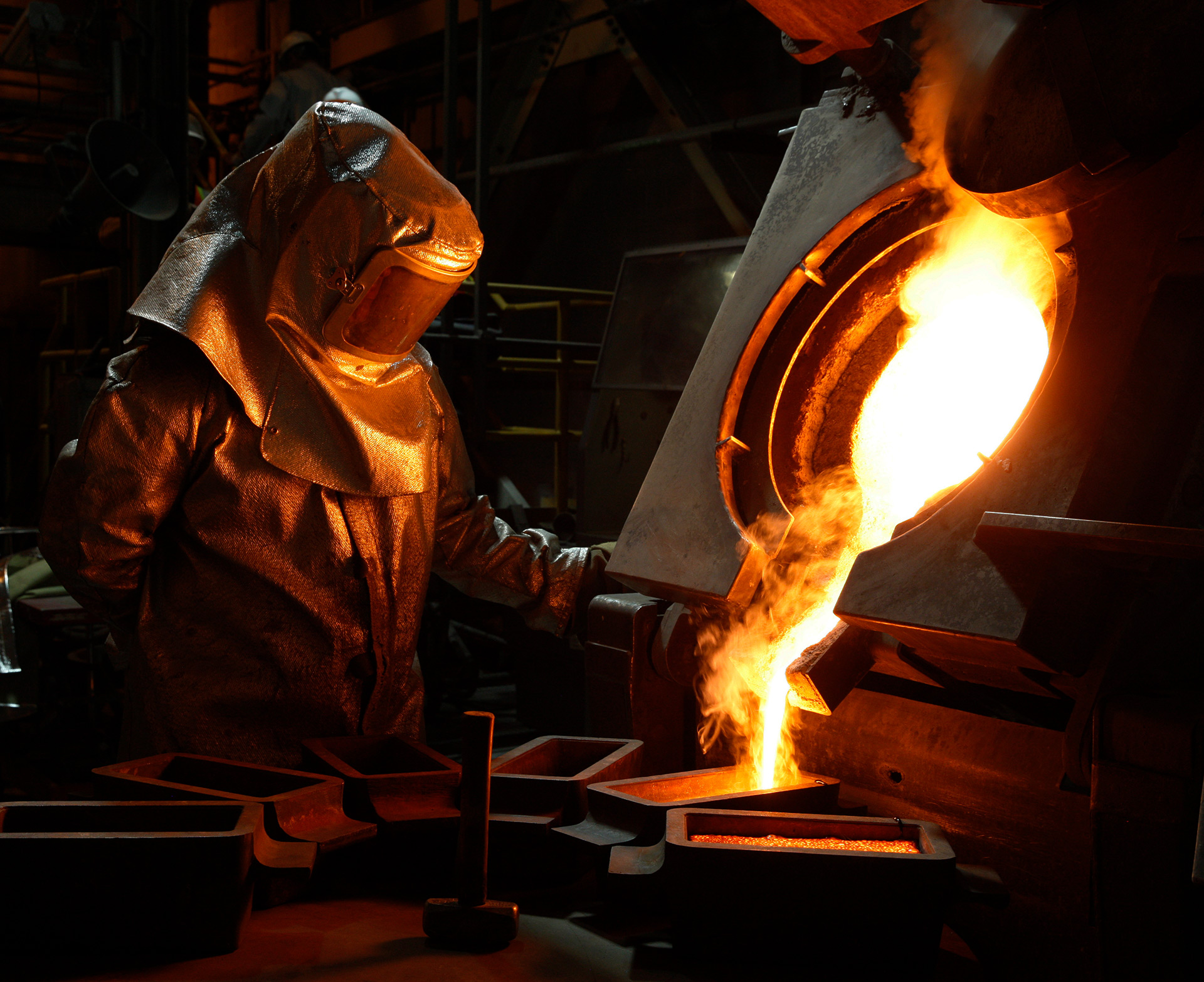
And the raw materials were very good. It's a pleasure to work with a client who already has a library of striking photography and compelling content, so much of the groundwork was already done. Sometimes it's just a matter of looking at the same thing from a different angle.
And the angle we landed on was: Why can't all of this content be part of a single, seamless experience?
The problem with any kind of website, is that the experience is always being interrupted by the necessity of navigating. So could we provide a robust architecture that could support exploration through traditional navigation, while also provide for those users who wanted to dispense with any kind of UI and have an entirely different experience?
Yes we could, is the answer.
We came up with this system of layered navigation panels, any one of which could be opened or closed at any time. If you wanted to skip to the Our History section, you could. If would wanted to click back to the landing page, you could.
But if you wanted to close all the navigation panes and scroll through the introduction, the timeline, the Living Our Values winners, all the way to end, you could do that too.
And as each area was given its own colour palatte, we could signal to a user they were changing sections by smoothly transitioning through the sidebar's different hues.

Simon P. Coyle
Branding and graphic design for new, small and growing businesses.
Made in Leslieville.
Branding
Brand Material Design
Creative Strategy
Digital Design
Identity Systems
Logo Design
Naming
Print Material
Visual Identity Design
Copyright © 1996—2024