Client
The Banff Centre
Agency
Usability Matters
Project Manager
Shannah Segal
Creative Director
Simon P. Coyle
Experience Designer
Nick Crampton
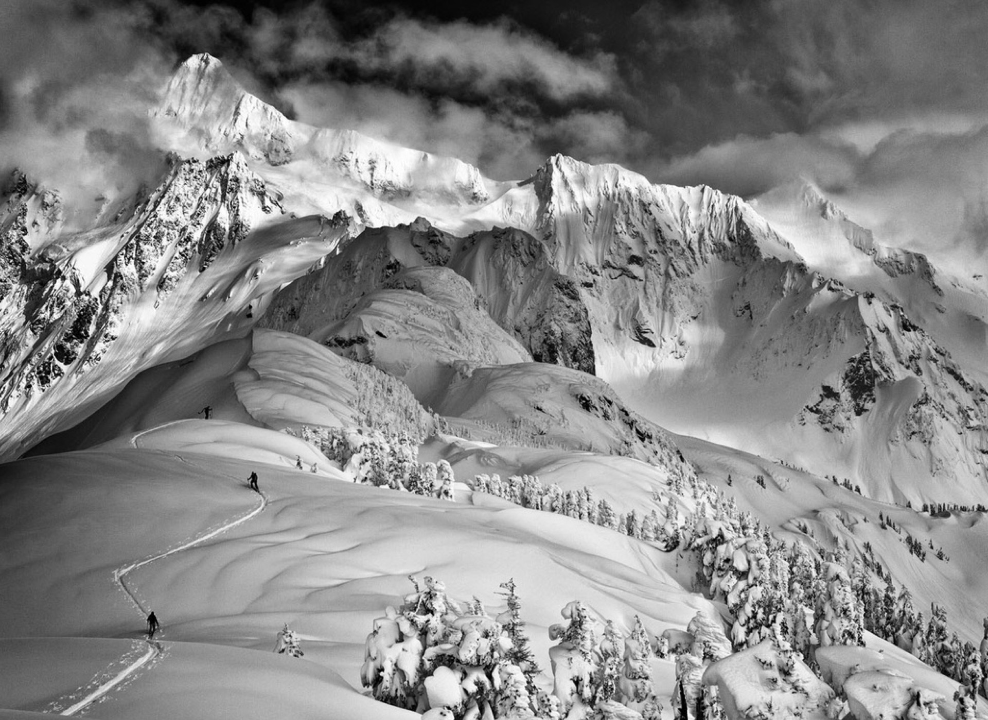
The Banff Centre is the largest arts incubator on the planet. It's not just a residence for artists to create and learn, it's also two hotels, a conference centre, galleries, a library, an archive, multiple event spaces, three restaurants, bars, music venues, a fitness centre and a media production facility, all nestled in the glorious Canadian Rockies.
Oh, and they've been running an annual, internationally-acclaimed film festival since 1976.
And the Banff Mountain Book Festival.
For any one of those things, creating a robust, comprehensive, usable online presence would be challenging enough. But put them all together and it's a major undertaking, one that required a highly inclusive, collaborative and considered approach.
Luckily, we had Nick, an extraordinarily talented User Experience Designer on our team.
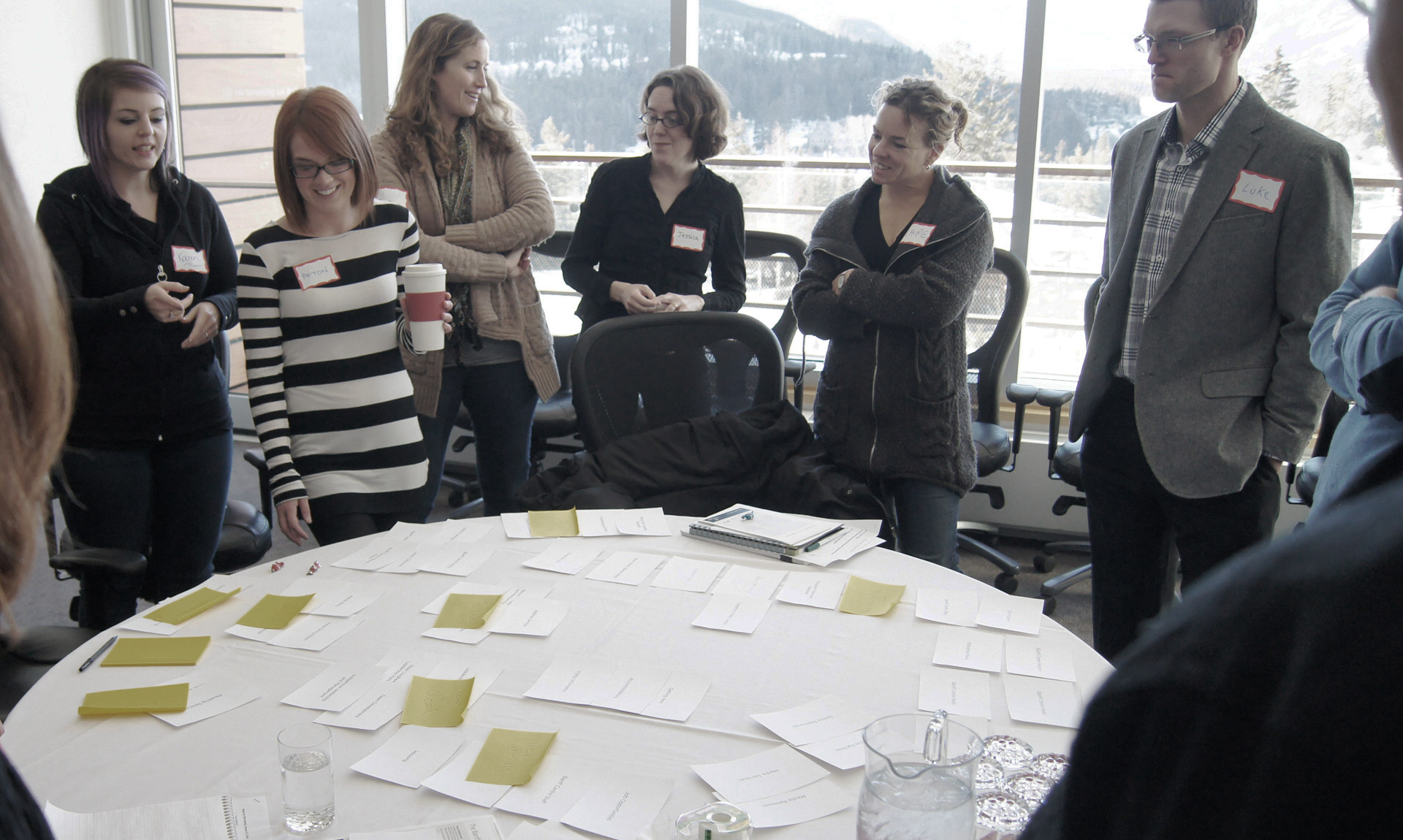
Nick and I flew to Calgary for three days of workshops with the Banff Centre's employees, directors and leadership. We were given tours of every nook and cranny, educated on the history of the Banff Centre, and generally given the run of the place.
The first day of workshops was given over almost entirely to a mammoth card-sorting exercise. With forty participants, who collectively reflected every facet of the Centre, this became the foundation of the interactive architecture for the new website.
While most of the workshop time was rightfully devoted to the user experience side of things, there were ample opportunities to pick brains on a visual direction too.
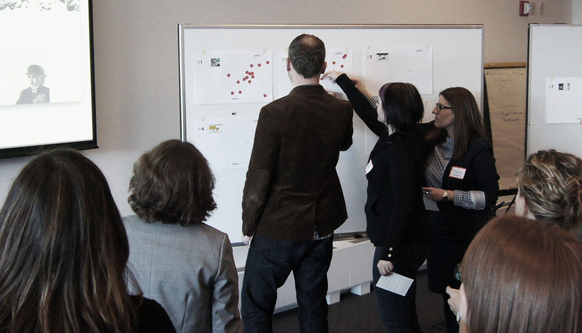
Above you'll see a "gut check" in full swing. Participants were shown 20 other web sites from among their peers and competitors (inasmuch as the Banff Centre has peers and competitors), and were tasked with putting red dots on a spectrum of how much they personally liked or did not like a particular design — and how on- or off-brand for the Banff Centre they considered each example to be.
Gut checks are great. You end up with a visual representation of the tastes and opinions of those in the room, which provides great fodder for further discussion, especially in those cases which have a very uneven split of likes and dislikes. And in my experience, the participants enjoy it too. UX exercises require a great deal of thought and can be mentally taxing. A gut check gives people the opportunity to express themselves in ways which are deeply subjective, and do not require any compromise with other considerations - at least at that moment.
What came out of this one, was that my initial instincts were way off. The broad consensus was that the Banff Centre had an appetite for something far more minimal and stylish than I had anticipated.
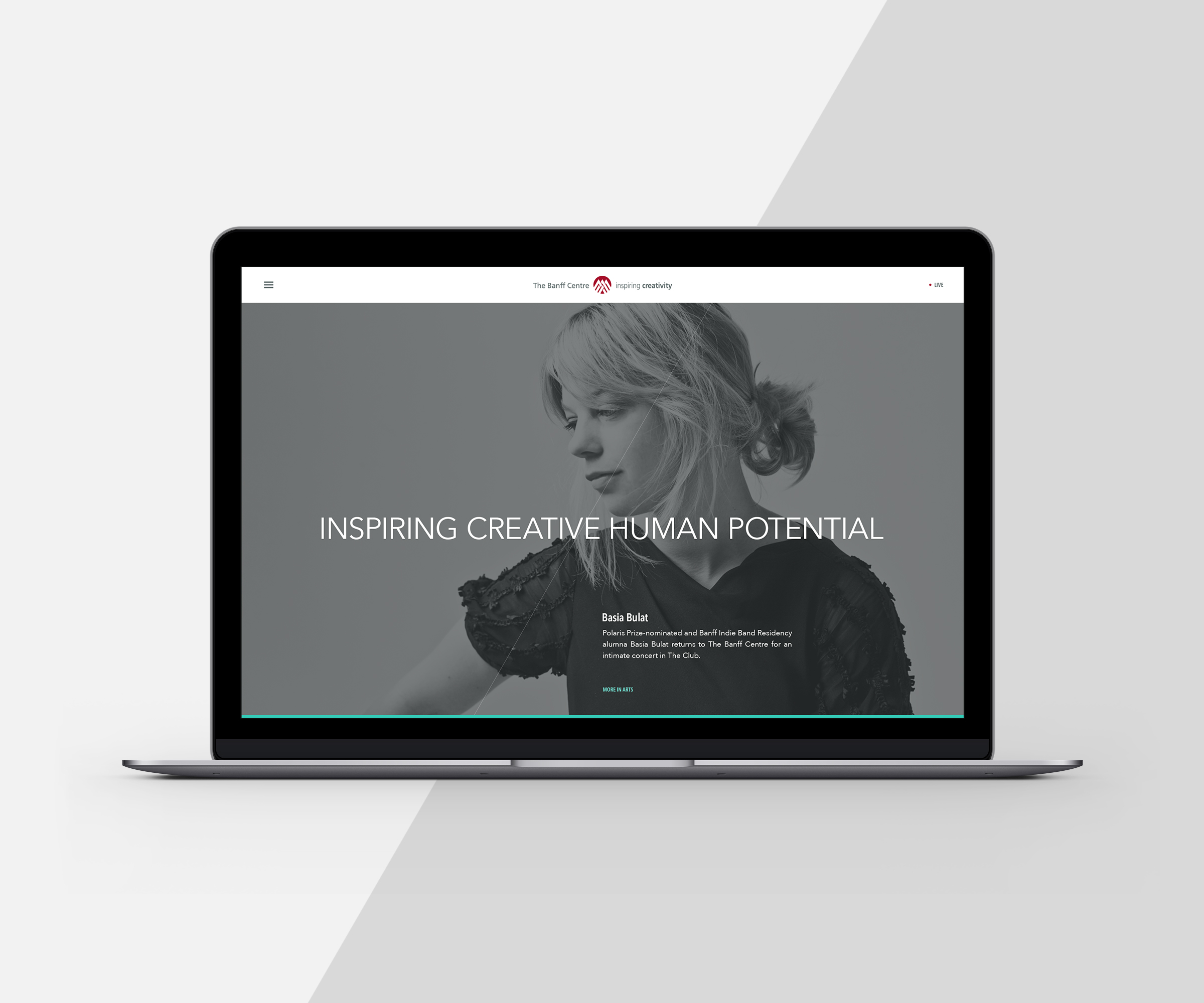
It was natural for the Centre itself to take a back seat to the talent it nutures and showcases, and the opportunities it offers.
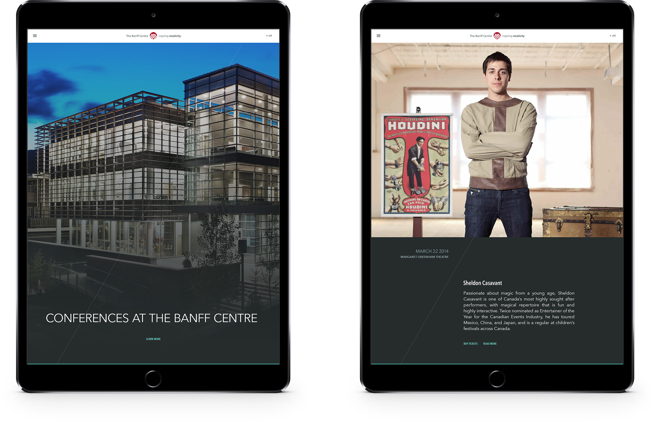
The visual design was driven by big, bold imagery and clean blocks of copy. The only piece of decoration, the diagonal line, represents a mountain.
In fact, that was the great thing about working with artists as clients.
"What is that diagonal line for?"
"It represents a mountain."
They nodded their heads and we moved on.
The navigation was similarly spare.
With so much on offer, so much potentially overwhelming information, the visual design was kept to an absolute minimum, hierarchy denoted by colour and whitespace, as opposed to any distracting adornments.
The navigation was similarly spare.
With so much on offer, so much potentially overwhelming information, the visual design was kept to an absolute minimum, hierarchy denoted by colour and whitespace, as opposed to any distracting adornments.
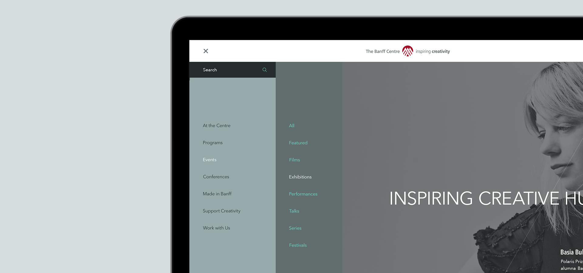
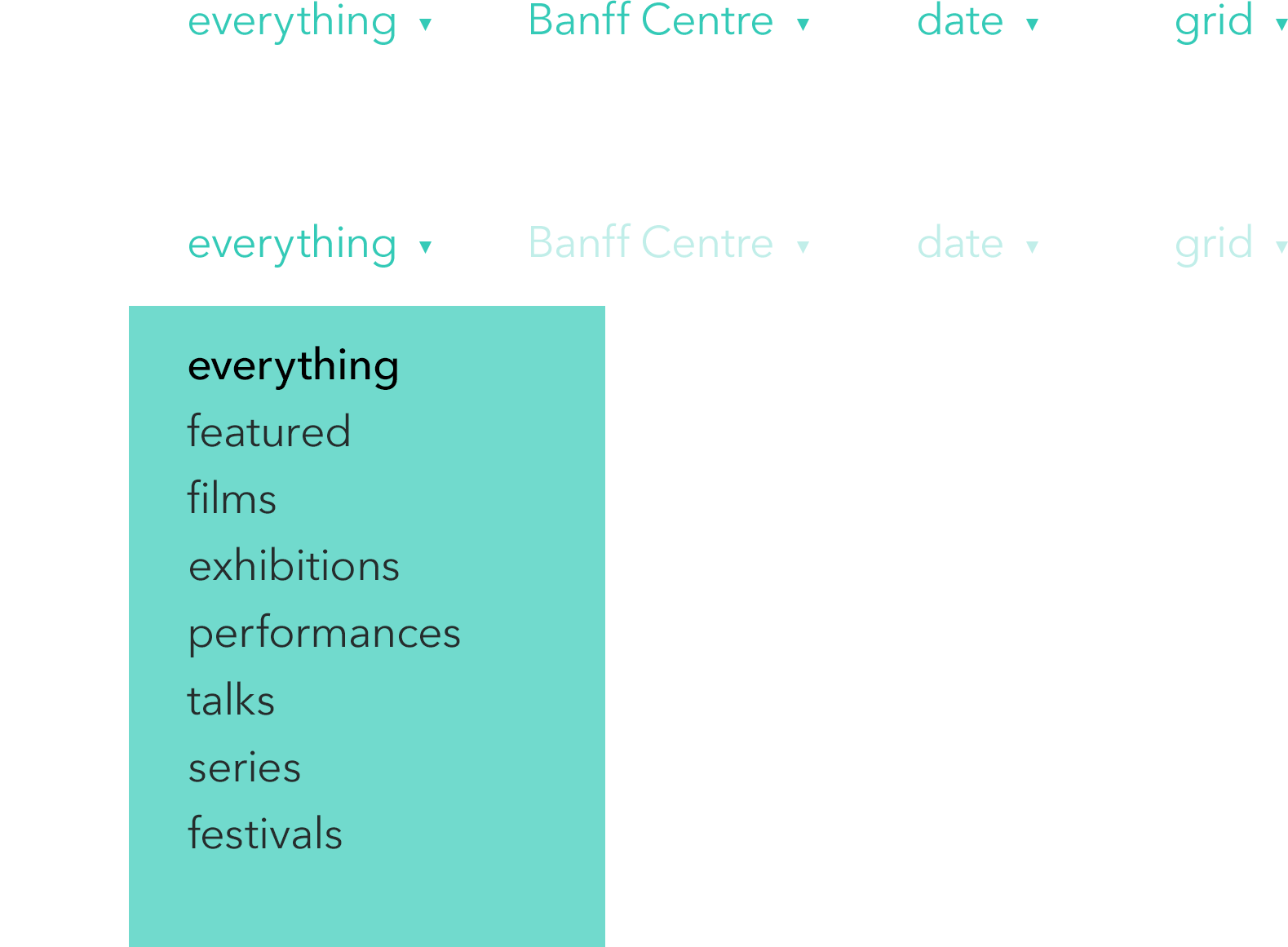
Given the sheer breadth of offerings from the Banff Centre, it seemed a bit much to expect a user to constantly be required to return the site's core navigation system to get around.
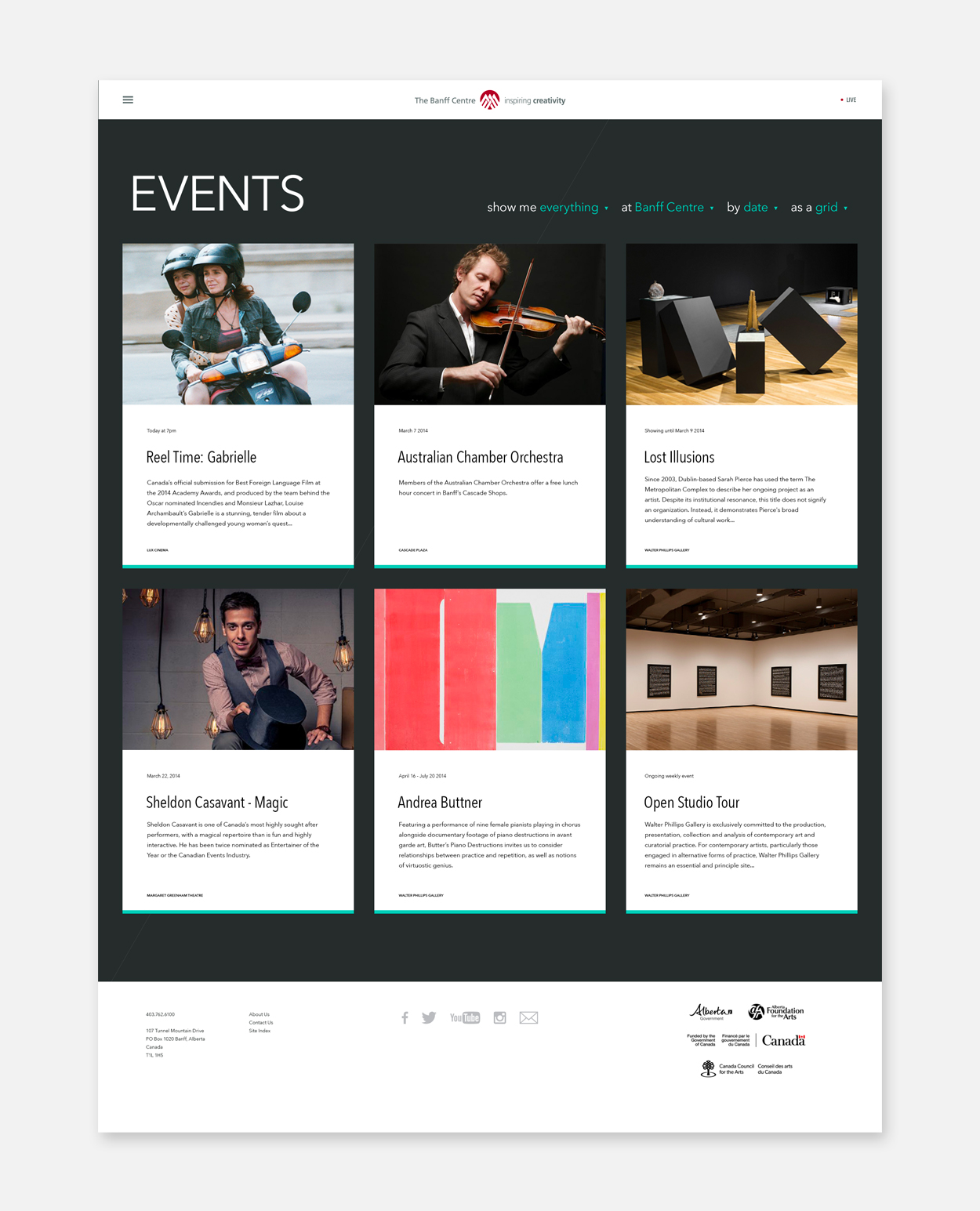
Nick and I put our heads together and come up with a couple of solutions. The first was this way of filtering huge amounts of information, such as the events listings.
This dynamic page filtering system was designed to put as little cognitive load on a user as possible. It speaks plain English, isn't technically or visually fussy and can be parsed as easily as any piece of written content.
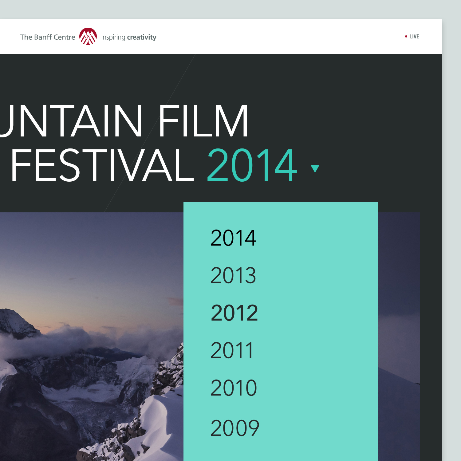
Nick and I became quite taken with this notion of where else we could add these little navigational shortcuts. We asked ourselves if actual page content could play a role in helping a visitor explore the Banff Centre website, and decided that there was no good reason it shouldn't.
So here, for example, you'll see the landing page of the Banff Mountain Film Festival 2014. The page title itself contains a dropdown menu which can be used to quickly and seamlessly navigate to the previous years sections.
The Banff Centre website is a project I look back on with great affection. The intense working sessions contrasted with periods of quiet and solitude in the evening mountain air. Touring the Centre, talking to the directors, inspired by their profound dedication and belief in the value of what they were doing. We were treated as welcome guests, and to this day I have never run a workshop in a more beautiful or invigorating setting.
Simon P. Coyle
Branding and graphic design for new, small and growing businesses.
Made in Leslieville.
Branding
Brand Material Design
Creative Strategy
Digital Design
Identity Systems
Logo Design
Naming
Print Material
Visual Identity Design
Copyright © 1996—2024